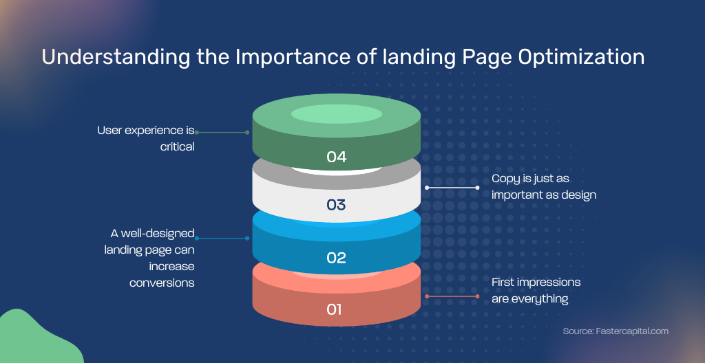
In the digital marketing world, the effectiveness of your landing page can make or break your business’s success. A well-optimized landing page serves as the cornerstone of your digital marketing efforts, directly influencing conversion rates and the effectiveness of your advertising campaigns. They’re where you make your final pitch, capture leads, and convert curious visitors into loyal customers. But with so much competition vying for user attention, simply having a landing page isn’t enough. You need a landing page that’s optimized for conversions
This read will focus on ten effective techniques that will transform your landing pages from passive billboards to active conversion machines. We’ll cover everything from crafting headlines that grab attention to implementing advanced strategies like A/B testing and social proof. By the end, you’ll be equipped with the knowledge and practical tips to create landing pages that consistently deliver impressive results.
P.S. If you require a professional website geek to create a well-optimized landing page or website for your business’s growth, send us a message!

Crafting Attention-Grabbing Headlines
Your headline is the first impression you make on a visitor, making it your best opportunity to make a compelling first impression. A great headline should be clear, and concise, and communicate the unique value proposition of your product or service. In a world of online distractions, you have mere seconds to capture their interest and convince them to stay. Headlines that promise value and spark curiosity are the key.
Example: When Dropbox launched its referral program, it used the headline “Get 500MB for Free – Refer a Friend“. This headline is clear, and concise, and directly addresses the user’s pain point (lack of storage space) while offering a solution (free storage). Evernote uses the headline “Remember Everything,” which succinctly conveys the primary benefit of their app to potential users.
Utilizing Compelling Visuals
High-quality visuals are more than just eye candy. They can significantly improve engagement, increase comprehension, and boost conversions. Images, videos, and infographics can all play a vital role in your landing page’s success. They should complement your brand and message, not detract from it. Use high-quality, relevant images or videos that illustrate your product or service in action.
Example: Unbounce, a landing page creation platform, uses a humorous video on its homepage that perfectly captures the frustration of dealing with clunky landing page builders. This video not only entertains but also positions Unbounce as the solution.
A small business might not have a large budget for custom photography, but using services like Unsplash or Canva can provide you with high-quality visuals at a lower cost. Ensure that any visuals are optimized for fast loading and are responsive to all device sizes.
Strategic Placement of Call-to-Action (CTA)
Your CTA button is the bridge that converts visitors into leads or customers. It should stand out visually and be placed in a prominent position on your landing page. Don’t make them hunt for it! Use contrasting colors and persuasive language that prompts action, such as “Get Started,” “Learn More,” or “Buy Now.” Place your CTA above the fold to ensure it’s seen without scrolling, and consider repeating it throughout the page for longer content.
Example: Evernote, a note-taking app, uses a bright yellow CTA button that says “Sign Up for Free” on their landing page. The color and text instantly grab attention and leave no doubt about the desired action.
Persuasive Copywriting
The words on your landing page need to do the heavy lifting of convincing visitors to take action. Use clear, concise language that speaks directly to your target audience’s needs and desires. Highlight the benefits of your offer and address any potential concerns. Focus on how your product or service solves a problem or improves your customers’ lives as addressing buyer fears on landing pages can increase conversion rates by 80%.
Use bullet points to make the content easy to scan, and include keywords for SEO purposes. Telling a story can also be a powerful way to connect with visitors emotionally and make your brand more memorable.
Example: Slack, a communication platform, uses clear and concise copy on its landing page to explain the benefits of its product. They focus on solving common workplace communication problems and showcase how Slack can streamline collaboration.
Implementing Social Proof
People are more likely to trust and engage with a product or service if they see others doing the same. Social proof, in the form of testimonials, reviews, and logos from trusted brands, can significantly increase conversions on your landing pages. Display logos of well-known clients, if applicable, and include real customer testimonials with photos to add authenticity. For startups, even a few positive reviews can make a difference in convincing visitors of your credibility.
Example: Help Scout, a customer service platform, features testimonials from major companies like Airbnb and Atlassian on their landing page. This social proof builds trust and positions Help Scout as a credible solution for businesses of all sizes.
Optimizing Forms for Higher Conversions
Landing page forms are essential for capturing leads, but lengthy or complex forms can lead to frustration and abandonment. Streamline your forms by only requesting the information you need. Even though forms are essential for converting visitors, they can also be a barrier. Simplify your forms to ask for only the most essential information. Test different layouts and numbers of fields to find the right balance between gathering useful information and not overwhelming users. Adding a privacy statement or security badge near your form can also help increase trust.
Example: Instead of a lengthy signup form, Spotify allows users to sign up with their Facebook account. This eliminates the need to enter personal details and creates a seamless user experience.
Ensuring Mobile Responsiveness
With the majority of web traffic now coming from mobile devices, your landing pages must be responsive and display flawlessly on all screen sizes. Use a responsive design that adjusts content and images automatically to fit different screen sizes. Test your landing page on multiple devices to ensure navigation and forms work seamlessly.
Example: HubSpot, a marketing platform, uses responsive design principles to ensure its landing pages adapt perfectly to any device, whether it’s a desktop computer, tablet, or smartphone.
Speed Optimization
Page load speed is critical for keeping visitors engaged because nobody likes waiting for a page to load. Slow loading times can lead to a significant drop in conversions. Use tools like Google’s PageSpeed Insights to identify issues that may be slowing down your page. Compress images, minimize CSS and JavaScript, and consider using a content delivery network (CDN) to speed up load times. A fast-loading page improves the user experience and can positively impact your search engine rankings.
You can also optimize your landing page speed by using compressed images, minifying code, and leveraging caching mechanisms.
A/B Testing
The best way to identify what works and what doesn’t on your landing page is through A/B testing.A/B testing, or split testing, involves comparing two versions of your landing page to see which one performs better. This involves creating variations of your landing page and testing them against each other to see which one performs better.
Test one change at a time, such as different headlines, CTAs, images, or page layouts, to understand what influences conversions. Use tools like Google Optimize for simple experiments. Continuous testing and optimization based on data will refine your landing page’s effectiveness over time.
Example: Landing page optimization platform Unbounce uses A/B testing extensively to improve their landing pages. By testing different headlines, CTAs, and layouts, they can continually refine their design for maximum conversions.
Continuous Improvement and Analysis
Landing page optimization is an ongoing process. Use analytics to track visitor behavior, conversion rates, and other key performance indicators. Pay attention to how changes in your landing page design or content affect these metrics. Regularly updating your landing page based on this data ensures it remains effective and relevant to your target audience.
Optimizing your landing page is an essential step towards achieving higher conversion rates, having a high-performing website, and maximizing the return on your marketing investments. By focusing on these ten techniques, you can create a landing page that not only attracts visitors but converts them into loyal customers. Remember, the key to a successful landing page is continuous testing and refinement based on user feedback and performance data.
Need expert help with website design, email marketing, social media management, and other marketing services? Geeks For Growth can help you drive growth for your business!
