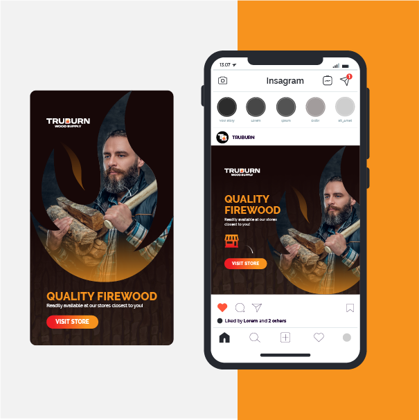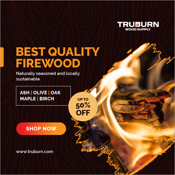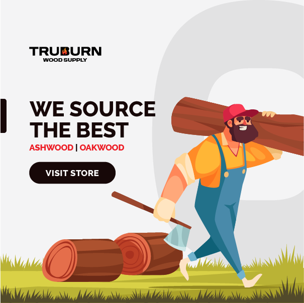
There are many ways to procure firewood/cooking wood, but TruBurn provides its buyers with the highest quality wood for the best price delivered consistently. TruBrun uses a natural, organic drying method with a kiln-finish. This gives the best of both worlds when it comes to the two types of wood drying.
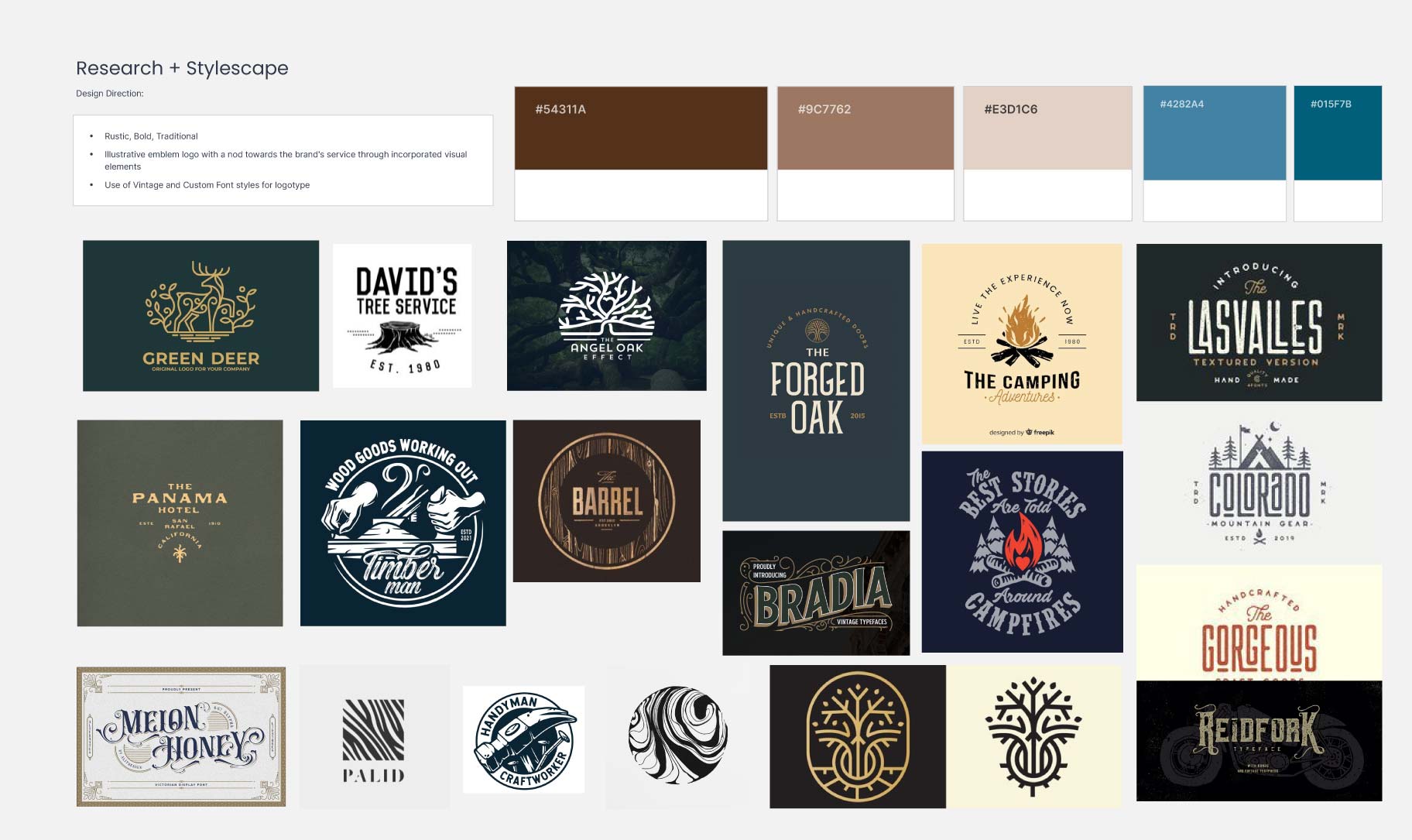
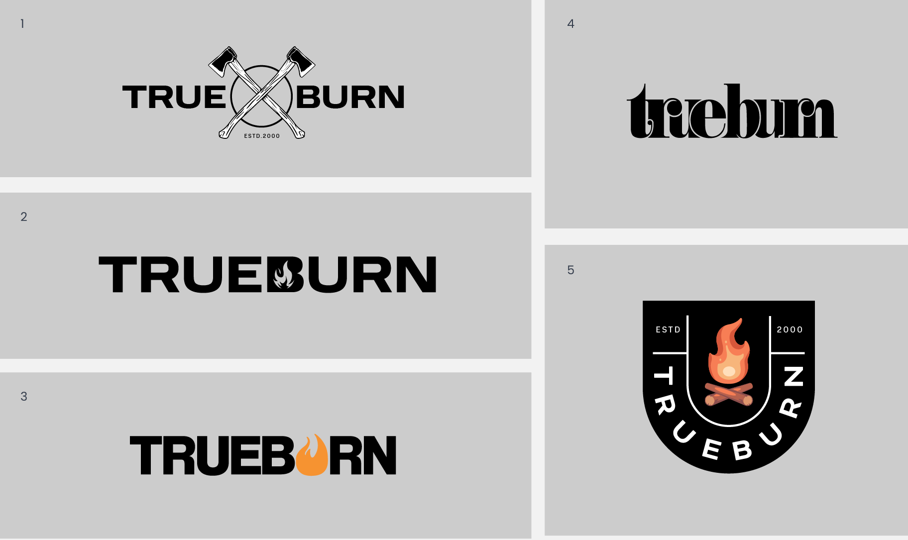
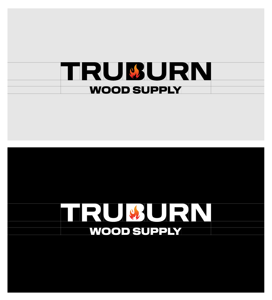
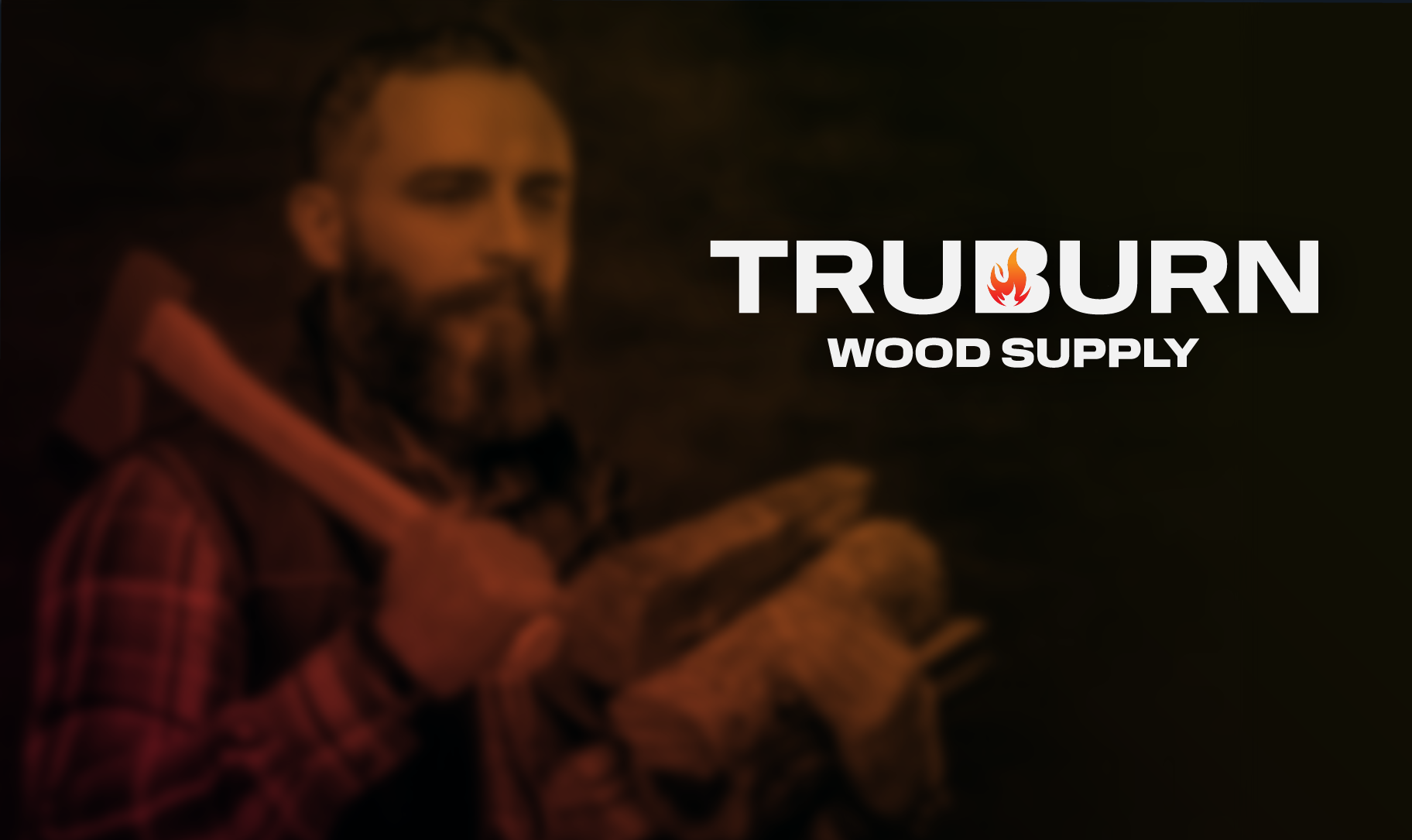
The client requested an identity that people can understand what they do instantaneously. Simple, trustworthy, established and professional. Out initial intake survey told us that they were looking for something that was rustic, unique and bold.