Build a brand with a startup design that converts on a seed-stage budget, a product that speaks for itself, and a launch that gets attention, without burning your runway.
1. Executive Summary: Grow Faster. Convert Smarter. Spend Less.
Startups don’t fail because they lack passion. They fail because they run out of time—or runway. And in that tiny window between MVP and market fit, design is either your secret weapon or your slow bleed.
This playbook is your tactical guide to building a brand that earns trust, crafting a UX that converts curious users into early adopters, and launching a go-to-market creative strategy startup design that gets your name seen, clicked, and shared.
At Geeks for Growth, we’ve helped early-stage startups go from pitch deck panic to polished brand presence in weeks, not months. And we’ve seen the data:
- Startups using lean design principles reach MVP 3x faster
- Founders who structure their above-the-fold UX well see up to 4x higher conversions
- Investors notice design—your deck, your site, your product—they see your startup through its aesthetics before they ever read the pitch.
This isn’t a theory dump or “design inspo” thread. It’s a get-it-done playbook for startup founders and CMOs who want results now, not someday.
Inside, you’ll find checklists, templates, mini-case studies, and rapid-action strategies covering:
- Lean startup branding that builds instant credibility
- UX principles that help you convert, even with minimal traffic
- GTM creative assets that can launch in a weekend
Download our Startup Design Sprint Toolkit to get started on your first 30-day sprint.
Before you finalize your pitch deck or start designing that landing page, make sure your startup has a name worth building around. In our cluster article “Naming Your Startup: The Psychology, Pitfalls, and Playbook”, we break down what makes a brand name memorable, legally sound, and pitch-ready—plus give you a checklist to validate your ideas fast.
It’s the perfect first step before diving into visual identity, messaging, or UX.

2. Why Great Startup Design Is Your Cheapest Growth Lever
You can’t outspend your competition, but you can out-design them.
The most successful startups aren’t always the best funded. They’re the best framed. In a world where attention is currency, design is your leverage.
You might think, “We’re not ready for branding yet. We’re still building.” But here’s the truth: if your homepage confuses users or your pitch deck feels like a high school presentation, you’re already behind—no matter how good your tech is.
The Proof Is in the Retention
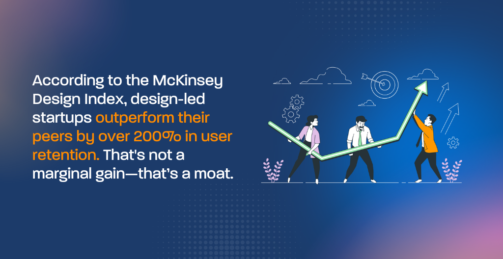
According to the McKinsey Design Index, design-led startups outperform their peers by over 200% in user retention. That’s not a marginal gain—that’s a moat.
Real Startup Win
One pre-seed SaaS founder we worked with came to us after burning $3K on a “pretty” landing page that converted no one. After reworking their above-the-fold UX (clear value prop, CTA clarity, mobile-first layout), their trial-to-paid conversion jumped 28%, with zero increase in traffic.
Founders’ Regret, in Their Own Words
“We spent $12,000 on logo options, brand boards, and a site that made us feel good—but didn’t move the needle. We’d trade it all for a headline and CTA that converted.”
Design isn’t decoration. It’s your cheapest growth lever.
And it pays you back fast.
If your current focus is GTM and traction, feel free to [skip ahead to the GTM Design section]—but bookmark this section. Your CAC will thank you later.
Great UX doesn’t stop at your homepage. In our guide on The Anatomy of a High-Converting SaaS Signup Form, we explore the exact design and psychology tweaks that make your trial form a growth lever instead of a bottleneck.
3. Lean Branding That Punches Above Its Weight
When budgets are tight, branding feels like a “later” task. But in reality, it’s your earliest moat.
3.1 Diagnose Your Brand Gaps
Before you chase more traffic or polish another pitch deck, pause and ask:
Does your brand say what you do—and why anyone should care?
Want to learn more about brand audits? We have an article fully dedicatecd to this. [Run the 10-Point Lean Brand Audit for Founders →] It’s fast, founder-friendly, and shows you where your brand is leaking trust before your next launch or investor deck.
Here’s a quick Lean Brand Gap Scorecard. Give yourself 1 point for each “yes”:
- We have a positioning statement that’s clear, specific, and 10 words or fewer
- Our logo, font, and color scheme are consistent across deck, site, and social
- When asked, “What do you do?” our team answers the same way
- Our homepage headline speaks to the pain our user feels
- Our founder’s story connects emotionally and builds trust
- Our call-to-action is visible in under 3 seconds on mobile
- Our product tagline or elevator pitch is memorable
- Our brand tone is defined and reflects our users’ reality
Score: 6–8 = Good shape | 4–5 = Needs tightening | 0–3 = Branding blind spot
“Even at the MVP stage, perception equals traction. A clear, credible brand wins trust before the product does.”
Download the Lean Brand Audit Checklist →
P.S Want to build brand trust before you even launch?
Read → [Founder Storytelling Frameworks for Investor-Ready Brands]

Deep Dive: Build a Lean Brand That Earns Trust From Day One
If you want a step-by-step breakdown of how to shape your startup’s positioning, tone of voice, and visual identity (without hiring an agency on day one), we wrote an entire guide just for that:
How to Build a Lean Brand That Earns Trust From Day One →
You’ll get:
- A plug-and-play positioning formula
- Voice exercises and tone examples
- A 3-day mini-sprint to launch your lean brand
Perfect if you’re still defining your narrative—or need to fix branding before scaling traffic.
3.2 Craft a Magnetic Value Proposition
A forgettable value prop wastes traffic, confuses investors, and weakens conversion. However, a magnetic one? It does the selling for you.
Here’s a formula we use at Geeks for Growth:
[Who You Help] + [Pain You Solve] + [Proof or Secret Sauce]
Examples:
AI SaaS: “We help HR teams reduce turnover by 37% using predictive AI that flags unhappy employees—before they quit.”
Biotech: “We help researchers compress multi-omics data analysis from 5 days to 5 minutes using a plug-and-play ML engine.”
B2B Fintech: “We help CFOs in growing startups eliminate cash flow blind spots with real-time banking overlays.”
Sounds like Y Combinator clarity? That’s the point. The best YC applications—and best startup sites—don’t get clever. They get clear.
Need help writing your value prop? Jump to our full guide → Startup Value Proposition Templates That Convert →
Pro tip: test your value prop as your site’s hero headline. Does it convert?
Want a detailed walkthrough on assembling your brand kit? How to Create a DIY Brand Kit That Doesn’t Look DIY →
Related Guide: Tone of Voice for Startups
Learn how to define and document your startup’s verbal identity so you sound as trustworthy as you look.
Wondering when to evolve your startup brand?
Don’t miss our cluster post: 👉 When to Refresh Your Brand Without Rebuilding It. It’s your cheat sheet for upgrading your message without losing your audience.
3.3 Bootstrap Visual Identity Without Looking Cheap
You don’t need a $30,000 branding package. However, you do need visual hygiene.
The minimum viable brand kit includes:
- A simple, scalable logo (horizontal + square variant)
- 2–3 brand colors and a typeface combo (Google Fonts works great)
- A clean one-pager deck layout
- A high-quality headshot and founder quote
Tools for Bootstrapped Brilliance:
- Looka or Brandmark: Auto-generate logo systems
- Figma kits: Free UI and deck templates
- Coolors.co: Build color palettes with contrast in mind
- Semplice: If you want a personal portfolio-style brand site
Pro tip: A confident, well-lit founder photo builds more trust than a $5K explainer video. People buy from people.
3.4 Startup Storytelling That Converts
Your story isn’t just for About pages—it’s a conversion asset.
Here’s a structure we recommend to founders:
Problem ➝ Failed Attempts ➝ Big Insight ➝ Product Vision ➝ Future Impact
Before (Generic Startup Mission):
“We aim to revolutionize retail with AI-powered decision-making.”
After (Human-First Narrative):
“After watching my family’s store close during COVID because we couldn’t move fast enough, I realized small retailers had no data tools. We built [Product] to help them make better inventory decisions in real-time, so the next family business doesn’t have to shut its doors.”
Add this narrative to your pitch deck opener and homepage copy. It turns a tool into a mission.
3.5 Brand Governance for Tiny Teams
Fast-moving startups break process—until it breaks them. In addition, A 1-page governance kit saves time, prevents visual drift, and aligns new hires.
Include:
- Logo usage rules and approved fonts/colors
- Tone-of-voice notes (e.g., no jargon, use contractions, speak to users, not VCs)
- Social media post guidelines
- Who signs off on pitch decks, social posts, bios, etc?
- Where to find the latest version of decks and brand assets
[Request the Lean Brand Governance Kit →]
4. Website & UX That Sells Your Vision (Before You Have Traction)
Good design doesn’t require thousands of users. Just one user who gets what you do—and converts.
4.1 Above-the-Fold: Your First 600 Pixels Must Convert
Most startup homepages fail because they bury the value prop below the scroll.
Here’s the formula we follow at Geeks for Growth:
Headline = Who it’s for + What it does + Why it matters
Subheadline = Emotional payoff or unique differentiator
CTA = Demo, Try it, Get Early Access (above the fold)
Example:
Built for remote CFOs. Real-time banking dashboards that cut cash flow blind spots by 90%.”
CTA: [See it in action]
Include:
- Trust badges (Techstars, Y Combinator, pilot customers)
- Product GIF or explainer
- Mobile-friendly spacing and button size
💬“Seed-stage sites that skip clarity waste their runway.”
4.2 DIY vs. No-Code vs. Custom UX: What’s Right for Your Stage
Not every startup needs a dev team for their MVP site. Here’s the trade-off:
| Platform | Best For | Pros | Limitations |
| Carrd | Pre-launch waitlists | Fast, simple, $19/yr | One-pagers only |
| Framer | MVP landing pages | Animation, CMS-lite, fast UX | Limited integrations |
| Webflow | Full sites with scale in mind | CMS, SEO, pro design feel | Learning curve |
| Figma-to-code | Design-heavy apps | Pixel-perfect control | Requires dev or expensive export tools |
Startup Tip: Spend on copy and structure first—animation and parallax can wait.
4.3 Forms, Funnels, and First Contact UX
If your goal is demo requests, signups, or waitlist conversions, your form is your funnel.
What We’ve Seen Work:
- Fewer fields = Higher conversions (3–4 max)
- Use microcopy for trust (“We won’t spam you.”)
- Pre-fill fields when users arrive from retargeting ads
- Add an optional “Upload deck” or “Ask us anything” field
Case Snapshot (Geeks for Growth Client):
Before: 9-field form, 4% conversion
After: 3-field form, microcopy, mobile-optimized = 14.2% conversion
[Book a Free UX Teardown Session →] (Only 3 available/month)
4.4 Mobile-First MVPs and User Testing on a Shoestring
Don’t wait for 1,000 users to “analyze data.” Ask 5 people to do 1 thing.
Tools You Can Use Today:
- Maze – Turn your Figma into tests
- Hotjar – See scroll + click behavior
- usertesting.com – Watch real users try tasks
- Google Forms + Loom – DIY test with friends or advisors
Tip: Ask them:
“What do you think this company does?”
“What would you click next?”
“What’s missing from this page?”
Consequently, early feedback beats later regrets.
5. Go-to-Market Creative That Doesn’t Burn Your Budget
You don’t need a full agency retainer to look launch-ready. You need the right assets—and nothing more.
Your MVP is ready (or almost). You’ve got a brand that makes sense. Now it’s time to go to market. But here’s the rub: you can’t afford to burn your entire raise on launch creatives that look good but don’t convert.
Let’s walk through what matters most.
5.1 MVP Launch Assets: What You Need
Skip the 18-tab launch plan. Most seed-stage startups can go to market with just five key creative assets:
- Pitch Deck – For fundraising, partnerships, or pilots
- Landing Page – Your digital storefront—above-the-fold clarity is non-negotiable
- Demo GIF or Loom Video – Show the product solving a real problem
- Social Explainer Card – A branded visual that travels well on LinkedIn, X, or Instagram
- 3 Paid Ad Variants – Simple, modular creatives for testing awareness vs. conversion hooks
Case Study:
A B2B fintech client came to Geeks for Growth with a clunky deck and no product page. We helped them launch with just a redesigned deck, a Loom walkthrough, and a clean one-pager. Result? 35% lower CAC in their first campaign.
Pro tip: If you only build one thing this month, make it a demo GIF and drop it in your email signature, socials, and landing page. Low effort. High return.
5.2 Decks That Raise Money (and Respect)
VCs read decks the way users scan landing pages—fast and brutal. You have ~2 minutes to prove you’re credible, focused, and scalable.
Here’s what your deck needs:
- Title Slide – Brand, contact info, and a 1-line value prop
- Problem – Real-world pain point; back it with data
- Solution – What you built and how it works (screenshot or diagram)
- Market Size – Big, growing, addressable
- Business Model – How you make money
- Traction – Metrics, pilots, or early users
- Go-to-Market Plan – How you’ll acquire users
- Team – Who you are and why you’ll win
- Ask – Funding needs, use of funds, next steps.
Design-wise:
- Use sans-serif fonts like Inter, Poppins, or Montserrat
- Stick to 25–35 words per slide
- Use visuals > bullets wherever possible
- Make the deck scannable—design for speed
VC Insight:
“If I don’t get it in the first 3 slides, I move on.”
— Based on Sequoia Capital’s Pitch Deck Template
[Download the Pitch Deck Aesthetics Guide →]
5.3 Ad Creatives That Don’t Feel Like Ads
Early-stage paid campaigns rarely work when they look… well, like ads. Your audience isn’t looking for a product—they’re looking for a solution that feels like a discovery.
Here’s how to build scrappy but smart ad creatives that convert:
Use Native Quote CardsTurn testimonials into simple cards with real user quotes, logos, or job titles. Great for trust.
- Founder-On-Cam Micro Videos: Use your phone and natural light. Answer one problem in 30 seconds. Post the video to LinkedIn and use it in retargeting ads.
- Motion Cards > Static Posts – Even slight movement (e.g., typewriter headline, swipe-in CTA) increases scroll-stop time.
- Carousel Strategies for B2B Startups – Slide 1 = Pain. Slide 2 = Insight. Slide 3 = Solution. Slide 4 = CTA.
Mini-hack: Use Loom to film a walkthrough of your product > Export > Cut into short GIFs > Use in retargeting ads and onboarding emails.
Ad budget under $500? Focus on:
- 1 quote-style card
- 1 founder video
- 1 demo GIF carousel
That’s all you need to test creative angles before scaling spend.
6. Design Systems That Scale With You
Don’t build for scale until you validate—but lay the groundwork now.
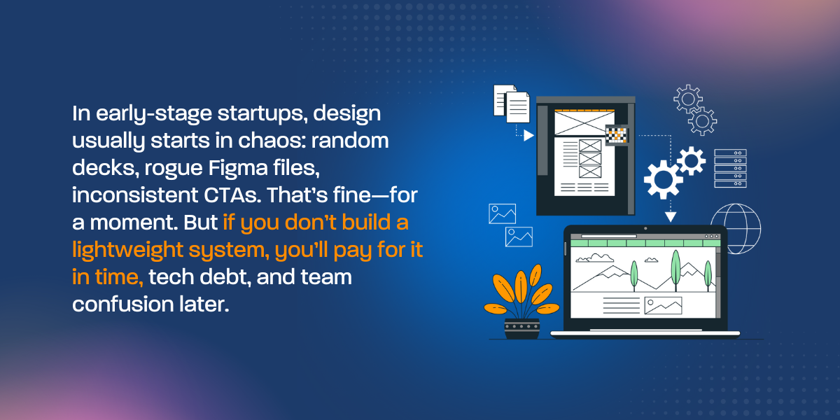
In early-stage startups, design usually starts in chaos: random decks, rogue Figma files, inconsistent CTAs. That’s fine—for a moment. But if you don’t build a lightweight system, you’ll pay for it in time, tech debt, and team confusion later.
Atomic Design Basics for Startups
Borrow from the atomic design methodology to keep things modular:
- Atoms: Buttons, fonts, colors
- Molecules: Input forms, nav bars, cards
- Organisms: Full hero sections, testimonial sliders
- Templates: Reusable landing page layouts
- Pages: Fully designed, published versions
Why it matters: When you build a modular system, you can scale fast without redesigning from scratch.
Tool Stack for Lean Design Ops
- Figma Component Libraries – Build once, reuse everywhere
- Notion Brand Guide – Document how-tos for new hires and contractors
- LottieFiles – Micro-animations that feel custom without the dev cost
- Zeroheight – If you want a public-facing design system (great for dev handoffs)
Pro tip:
“Even a 5-page brand ops doc prevents $10K in future redesigns—and keeps contractors from guessing.”
When to Systematize
- When you’re hiring your first marketer or designer
- When your team size hits 5+
- When you’re launching 2+ landing pages per quarter
- Before Series A
Bonus Idea: Assign a single Notion page as your “Design System Hub.” Include:
- Brand voice/tone
- CTA styles
- Link to latest deck + homepage
- Figma asset libraries
- Loom walkthroughs for updating sections
7. Mistakes That Cost Founders Time, Traction, and Trust
Design missteps don’t just slow you down—they signal weakness to users, investors, and even your team.
Founders don’t mess up because they’re careless. They mess up because they’re moving fast and often flying solo. Also, the key isn’t perfection. It’s knowing what not to waste time on.
Here are five costly (and common) startup design mistakes—and how to fix them before they slow your launch.
❌ 1. Designing Without Clear Positioning
Why it hurts: You end up with a “cool” website that says nothing. Users bounce. Investors skim past.
Quick fix: Use this fill-in-the-blank formula:
“We help [who] solve [pain] with [product] that does [differentiator].”
❌ 2. Skipping Mobile Testing on MVPs
Why it hurts: 70 %++ of early visits happen on mobile—especially from Product Hunt, Twitter, or ads. If your layout breaks or CTA buttons are hard to find, you’re losing conversions fast.
Quick fix: Use Chrome dev tools or BrowserStack to simulate mobile. Prioritize CTA visibility, font size, and load time.
❌ 3. Decks With Mixed Fonts, Colors, and Layouts
Why it hurts: VCs and partners read your deck like a pitch and a design test. Inconsistency = amateur.
Quick fix: Stick to one font family (e.g., Inter or Poppins), one primary color, and use a 12-slide consistent layout.
📥 Download our [Pitch Deck Aesthetics Guide →]
❌ 4. Sites With Unclear or Buried CTAs
Why it hurts: Users don’t know what to do next, so they leave. A vague CTA like “Learn More” on a pre-launch SaaS homepage = dead traffic.
Quick fix: Make the CTA benefit-focused and specific:
“Get Early Access”
“Watch the 60-Second Demo”
“Join the Waitlist”
❌ 5. Hiring an Agency Before You Nail Your Messaging
Why it hurts: You pay for high-end design that’s anchored to unclear copy. Beautiful site, no results.
Quick fix: Nail your positioning and one-liner first. Then bring in partners like Geeks for Growth to elevate it.
Remember: Your first impression isn’t your product—it’s your presentation.
8. Case Snapshots
Real founders, fixes and real growth.
Startup success rarely happens in a straight line. But when founders get their design and messaging aligned, the results are fast and measurable. Here are three anonymized case snapshots from startups we’ve worked with.
Case 1: SaaS with No Signups After Launch
Problem: The founder had an MVP and a clean landing page, but conversions were near zero. No one understood the value.
Fix: We rewrote the hero headline using our startup value prop formula, clarified CTA language, and simplified the site hierarchy.
Result: Signup conversion increased by 2.4x in 30 days, using the same traffic and platform.
“Clarity beats cleverness. Once users got it, they started signing up.”
Case 2: Fintech Pitch Deck That Didn’t Land Meetings
Problem: The slides were dense, inconsistent, and lacked visual structure. The founder was sending it cold to VCs and getting ghosted.
Fix: We overhauled the design using Sequoia’s pitch template, simplified the visual flow, and added clear traction metrics early in the deck.
Result: The startup secured 2 intro meetings in the first week of sending the redesigned deck, and closed a $500K seed round within 60 days.
“Figma made us look $ 1 M-ready on a $5K budget.”
Case 3: B2B Platform With High CAC From Paid Ads
Problem: The startup was running ads but landing users on a slow, generic site with no clear CTA or differentiation.
Fix: We created 3 modular landing pages targeted by segment, added testimonial quote cards, and a founder video.
Result: CAC dropped by 40%, and lead quality improved (shorter sales cycles, more demos booked).
“We didn’t change our product. Just the way we presented it.”
Want to see more?
[Book a Free 15-Min Brand or UX Audit →].
9. Action Plan: 30-Day Design Sprint for Seed-Stage Founders
Move fast. Get focused. Launch with confidence.
If you’re short on time (and who isn’t?), follow this proven 4-week sprint to align your brand, polish your presence, and prep for growth.
First Week: Audit Your Messaging and Brand Gaps
- Use the Lean Brand Audit Checklist to score your startup’s core assets
- Refine your positioning statement: who you help, how, and why it matters
- Define your brand tone of voice (e.g., bold, empathetic, tactical)
- Update or create a simple Notion brand guide (colors, fonts, logos, CTA tone)
Struggling with early messaging clarity? Our deep dive on why most startup taglines fail—and how to fix yours is a must-read before you hit publish.
Second Week: Launch Your Lean Landing Page
- Built with Carrd, Framer, or Webflow
- Above-the-fold = value prop, visual, and CTA
- Add social proof: a testimonial, a waitlist count, or an early press mention
- Test on mobile and reduce load time to <2.5 seconds
Third Week: Create Your Pitch Deck + Motion Demo
- Use our Pitch Deck Aesthetics Guide
- 10–12 slides: problem, solution, market, traction, GTM, team, ask
- Record a Loom or create a demo GIF walkthrough of your product
- Add to your site, email signature, and investor outreach
Fourth Week: Run a UX Feedback Sprint
- Ask 5 people (not friends) to test your site or deck
- Use Maze, Hotjar, or a Google Form
- Questions to ask:
- “What do you think we do?”
- “What’s confusing?”
- “Would you take the next step?”
Wrap the sprint with small fixes, publish updates, and prepare to share your story publicly. This is how you launch smart—without the waste.
[Download the Startup Design Sprint Toolkit →]
Conclusion: Design Like a Startup That Plans to Win
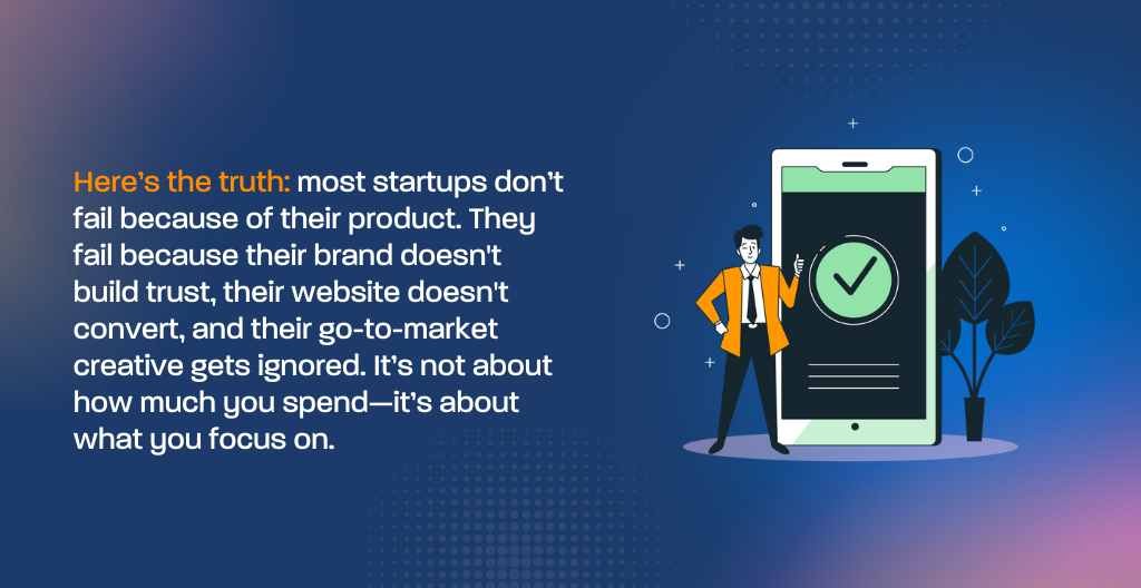
Here’s the truth: most startups don’t fail because of their product. They fail because their brand doesn’t build trust, their website doesn’t convert, and their go-to-market creative gets ignored.
It’s not about how much you spend—it’s about what you focus on.
You could spend months iterating on features, chasing growth hacks, or tweaking color schemes. However, without clarity in your positioning, credibility in your brand, and intent in your design, you’re leaving money—and momentum—on the table.
Design is not decoration.
It’s not just your logo, your fonts, or that Figma file you haven’t touched in weeks. Another key point, design is the sum of how your startup communicates:
- Who you are
- What you do
- Why it matters
- Why should someone care today, not six months from now
Furthermore, this playbook gave you a lean, fast-moving approach to do just that.
We showed you how to:
- Diagnose your brand using a quick audit, not a 40-page strategy doc
- Craft a magnetic value prop that speaks clearly to your ideal customer
- Launch with just 5 essential GTM assets instead of wasting weeks on things that don’t move the needle
- Test and iterate UX using free tools and real users, not guesswork
- Build startup design systems that save time, money, and chaos as you grow.
- Also run an SEO audit to know where your brand stands.
All of this is rooted in one belief: early-stage startups deserve design that works, without burning through runway.
ou don’t need a six-figure brand agency. Instead, you need the right message—packaged clearly, delivered confidently.
And here’s the kicker: when your startup design is aligned, your site converts better, your pitch lands cleaner, your product feels more polished, and your team gets more focused. In other words, good startup design doesn’t just look better—it makes everything run better.
Moreover, as a startup founder or CMO, you’re constantly juggling urgency with uncertainty. Should we launch this now? Will this version work? What if the market doesn’t get it?
That’s exactly where design makes the difference.
Clarity attracts. Confidence converts. And consistency scales.
By this point, if you’ve made it this far in the playbook, you’re already in the top tier of startup operators—the ones who are thinking ahead, not just reacting to fires. After all, you know that how you show up visually and strategically can be the difference between a product people ignore and a company people believe in.
Now, it’s time to put it into action.
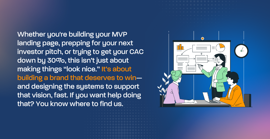
Whether you’re building your MVP landing page, prepping for your next investor pitch, or trying to get your CAC down by 30%, this isn’t just about making things “look nice.” Rather, it’s about building a brand that deserves to win—and designing the systems to support that vision, fast. So, if you want help doing that? You know where to find us.
10. Grow Faster Without Looking Cheap With Your Startup Design
Great startup design doesn’t have to cost you $50K. It just needs to do its job. This playbook showed you how branding, UX, and GTM creative, when done lean, can help you go from idea to traction 3x faster and convert more users without bloating your budget.
Startup design isn’t a luxury. Furthermore, it’s your cheapest, most scalable growth lever. Now, let’s take action:
- [Book a Free 15-Minute Startup Brand Audit]
- [Download the GTM Creative Toolkit] for launch-ready assets
Heads up: To keep things personalized, we only offer 3 audit sessions per month per industry. First come, first served—no conflict overlap.