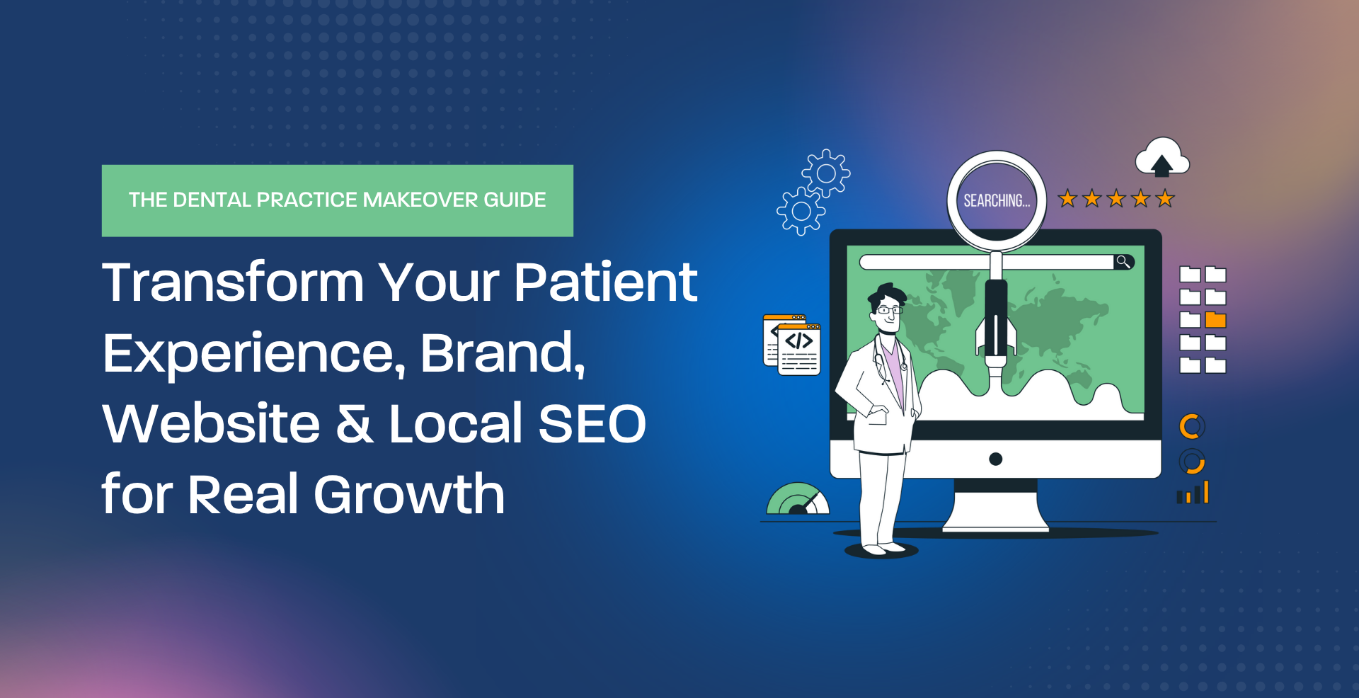
Table of Contents
Toggle
What Makes a Dental Website High-Converting?
A high-converting dental website doesn’t “look expensive.” It removes uncertainty. It helps the right patients quickly understand what you do, why they should trust you, and exactly what to do next.
Most dental websites don’t fail because they’re ugly. They fail because they’re vague, slow, hard to navigate on mobile, or built like brochures instead of decision tools. Patients land on the site with a question and leave with no confidence.
This guide breaks down the practical elements that turn websites into booked appointments—the messaging, structure, trust signals, speed, and conversion mechanics that matter in real practices.
If you want a broader set of dental growth resources (local visibility, service pages, reviews, and measurement), start here: Geeks for Growth Dental Marketing.
What This Guide Covers
You’ll learn how high-converting dental websites work in practice—how they earn trust fast, guide patient decisions, and connect marketing traffic to a real booking outcome.
You will learn how to:
- Understand what “conversion” actually means for a dental website (not just form fills)
- Fix the most common reasons dental sites get traffic but don’t book
- Design the first scroll to answer the patient’s real questions
- Build service pages that pre-qualify and reduce low-intent calls
- Use reviews, proof, and process clarity to reduce shopping behavior
- Improve mobile speed and user experience (where most bookings happen)
- Align website conversion with front desk workflows so leads don’t die
What “High-Converting” Means in Dentistry
In dentistry, conversion isn’t a one-step action. A “conversion” is any next step that reliably becomes a scheduled visit. Depending on your practice and services, that might be:
- Click-to-call from mobile
- Consult request (implants, Invisalign, veneers)
- Emergency call (same-day availability intent)
- New patient booking via online scheduling (where appropriate)
What matters is not the button. What matters is whether the website consistently produces booked appointments with acceptable patient quality.
If you’re seeing visits but not bookings, this is a useful diagnostic: Dental Website Traffic but No Patients?
The “Decision Friction” Problem (Why Patients Leave)
Most patients aren’t trying to become dental experts. They want to know:
- Are you the right fit?
- Will I be treated well?
- What happens next?
- Is this going to be expensive and unpredictable?
A high-converting website reduces friction around those questions. A low-converting website increases it—through vague promises, missing information, confusing navigation, and weak next-step clarity.
The homepage reads like a generic brochure. Patients can’t tell what you’re known for, who you help, or how to book.
Few reviews, no proof, no process explanation, no “what to expect.” Patients keep shopping.
Slow load, tiny buttons, hard-to-find phone number, long forms. Patients bounce.
Multiple CTAs, no priority, no expectation-setting. Patients hesitate.
Conversion-first framing companion: Why Dental Websites Should Be Built for Conversion First
YouTube #1: “Website Secrets” (A Useful Baseline)
This video is helpful as a baseline overview of what tends to work across many dental sites. As you watch, translate “secrets” into real practice mechanics: clarity, trust, speed, and a booking path that’s hard to mess up.
Operator takeaway: a “good-looking” website is not the goal. A website that reduces uncertainty is the goal.
The First Scroll: The Highest-Leverage Conversion Surface
The first screen of your homepage (and each major service page) should answer three questions immediately:
- What is this practice known for? (in patient language)
- Is this for me? (who you serve / common problems)
- What should I do next? (call, request a consult, book)
Many practices default to “Welcome to our practice” headlines. That wastes the most valuable space on the website. If you want a practical checklist for the top of the page, use: What to Include Above the Fold on a Dental Website.
What to put above the fold (in plain English)
Above-the-fold essentials
- One clear headline: what you do + who you help (no fluff)
- One trust cue: review rating, “new patients welcome,” insurance note, or credibility marker
- One primary action: call / request consult / book (pick one)
- One expectation line: what happens next (e.g., “same-day emergency calls welcome” or “request a consult and we’ll confirm within 1 business day”)
Service Pages Are Where High-Intent Patients Decide
In dentistry, most high-intent traffic lands on service pages—not the homepage. If those pages are thin or generic, you lose the patient at the exact moment they’re ready to act.
High-converting service pages do three jobs at once:
|
Job 1: Build decision confidence
What it looks like: who it’s for, what changes after treatment, what the process looks like, and what to do next.
|
|
Job 2: Reduce shopping behavior
What it looks like: comfort language, realistic expectations, and answers to common objections (pain, time, cost, fit).
|
|
Job 3: Support the front desk
What it looks like: clear “what happens next” so calls are easier to convert and patients arrive with fewer misunderstandings.
|
Service page resources:
- Creating Dental Service Pages That Actually Convert
- How Service Pages Should Be Written for Dental SEO
Cost Clarity Is a Conversion Tool (Not a Pricing Debate)
One of the biggest silent conversion killers is cost anxiety. Patients don’t need exact prices on every page, but they do need:
- what impacts cost
- how estimates work
- financing/insurance expectations where relevant
- what the first visit includes
When cost is handled responsibly, it filters out price-only shoppers and increases the quality of booked consults.
Related: Why Your Dental Office Needs a Cost Page and Dental Website Trust Issues.
Reviews: The Fastest Trust Shortcut (When You Systemize Them)
In competitive markets, reviews often decide the shortlist. The website should make reviews easy to find, and the practice should make reviews easy to earn.
Practical moves that improve conversion quality:
- feature review snippets near key CTAs (not just on a “Reviews” page)
- respond to reviews in a calm, professional tone
- build a steady review request process (not a random push)
Helpful resources:
- Google Reviews for Dental Practices
- Automate Review Requests Without Sounding Pushy
- Multi-Location Review Strategy
YouTube #2: Real High-Converting Landing Page Breakdown
This video is useful because it shows what “conversion-focused” actually looks like in a real page. Landing pages are narrower than full websites, but the logic is the same: match intent, reduce risk, and make the next step simple.
Operator takeaway: conversion rates improve when the page answers objections before the patient has to ask.
Mobile Speed and UX: The Non-Negotiables
Most dental website sessions are mobile. That means your conversion system is only as strong as your mobile experience.
High-converting dental sites typically have:
- fast load times (especially the first screen)
- click-to-call that’s easy to find and tap
- short forms with clear expectations
- no pop-up chaos that blocks the main action
Resources:
Compliance and Form Design (Keep It Simple and Safe)
Many practices accidentally create conversion friction by asking for too much information too early—especially on forms. Patients want a simple next step. Anything that feels invasive increases abandonment.
Two practical guardrails:
- Keep forms minimal. Name, contact, reason for visit is usually enough for a first step.
- Route sensitive details to phone or secure systems.
Reference: HIPAA-Compliant Dental Website Forms and ADA Compliance Essentials.
Instagram: Practice Websites That “Feel” Intentional
These reels are a reminder that aesthetics matter, but in a specific way: design should support trust and clarity. Calm structure, consistent visuals, and readable layouts can reduce anxiety and improve conversion—when paired with strong messaging and CTAs.
Operator takeaway: design is a trust signal when it supports calm, clarity, and consistency.
Operator takeaway: “funnels” only work when the website experience and next step are frictionless.
Operator takeaway: marketing ideas are common; conversion systems are rare. Build the system.
YouTube #3: Building a High-Converting Dental Website (Mechanics + Focus)
This video leans into implementation. Even if you don’t build sites yourself, it’s useful because it highlights what should be prioritized: speed, mobile usability, and a booking path that is simple.
Operator takeaway: platforms matter less than priorities—clarity, speed, trust, and next-step simplicity.
How the Website Should Support the Front Desk (So Leads Don’t Die)
A website can generate demand, but the front desk turns demand into scheduled visits. A high-converting website supports the front desk by:
- setting expectations for what happens next
- answering predictable questions upfront (hours, insurance, cost factors)
- routing urgency correctly (emergency calls should be obvious)
- reducing confusion so calls are shorter and smoother
Operational companion reads:
A Practical Website Upgrade Plan (30 Days, No Rebuild Required)
If your website is underperforming, you don’t always need a full redesign to improve conversion. Start with high-leverage fixes:
- Fix the first scroll on the homepage and top service pages.
Clarify who you help, what you’re known for, and one primary action. - Improve mobile conversion mechanics.
Click-to-call visibility, simplified forms, eliminate friction. - Upgrade your top 3 service pages.
Decision-focused structure: fit, process, cost factors, FAQs, CTA. - Strengthen trust signals.
Reviews, “what to expect,” and reassurance around anxiety and comfort. - Address performance basics.
Speed fixes, image optimization, and mobile usability cleanups.
Quick companions:
- 5 Homepage Fixes That Increase Appointment Requests
- Designing a Website That Matches the Patient Journey
Key Takeaways
High-Converting Dental Websites Reduce Uncertainty and Make Booking Easy
- A high-converting site is a decision tool, not a brochure.
- The first scroll should answer: fit, trust, and next step—immediately.
- Service pages are where high-intent patients decide; write them for decisions, not keywords.
- Reviews and cost clarity reduce shopping behavior and improve patient quality.
- Mobile speed and usability are non-negotiable because most bookings happen on phones.
- Website conversion improves when it supports front desk workflows and expectation-setting.
Explore Helpful Resources
Want a Website That Produces Booked Appointments Consistently?
If your site is getting visitors but not bookings, the fix is usually clarity, trust, speed, and a simpler next step—not “more traffic.” Small changes in the right places can materially improve conversion and lead quality.
Geeks for Growth helps dental practices build conversion-first websites and marketing systems that compound: service page architecture, local visibility, review engines, and measurement tied to booked appointments—without gimmicks or inflated promises.
Explore Dental Marketing Request Strategic Guidance Browse Resources
This content is produced by the Content Team at Geeks For Growth. Through their proprietary Megaphone publishing system and structured SEO framework, they design search-driven marketing systems for law firms, dental practices, remodelers, startups, real estate firms, fintech companies, and agencies across the United States.