In today’s digital age, our users are everywhere: in courtrooms, at the dentist’s office, or managing their businesses on the go. Your website or application must speak their language no matter what device they use, which is designing for different screen sizes. Whether it’s a smartphone, tablet, desktop, or even a smart TV, your digital presence needs to adapt and shine.
In this article, we’ll dive deep into the art and science of designing for different screen sizes. We’ll cover the nitty-gritty of responsive and adaptive design, exploring everything from fluid grids to CSS media queries. You’ll learn how to build user-friendly experiences that drive conversions and build trust—no matter who your audience is.
Geeks For Growth has a free guide titled – Learn hyper-local advertising strategies, which focuses on how small businesses like yours can increase the relevance of your ads and improve visibility among potential customers who are within the immediate vicinity.
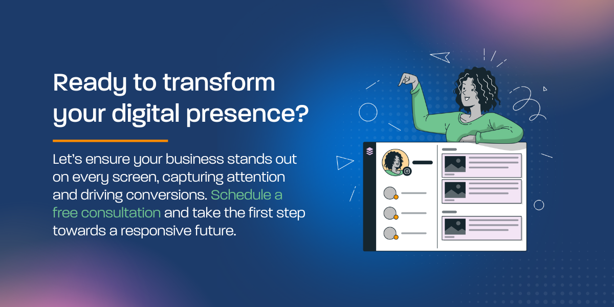
Do you need expert help with reaching your audience, website or graphic design, email marketing, social media management, and other marketing services? Schedule a consultation with Geeks For Growth so we can help you drive growth for your business!
The Importance of Responsive and Adaptive Design
Imagine this: A client is accessing your site on a smartphone during a busy day at the office. If your website isn’t optimized for smaller screens, the content might appear squished or, worse, completely unusable. In today’s market, a poorly designed site can lose you clients in an instant. Responsive design ensures that your digital platform remains visually appealing and functionally robust across all devices.
Responsive vs. Adaptive Design: What’s the Difference?
Before we jump in, let’s clarify two essential terms:
- Responsive Design: This approach uses flexible grids, images, and CSS media queries to create a fluid layout. The design “responds” to the screen size, scaling up or down naturally.
- Adaptive Design: Instead of one fluid layout, adaptive design relies on multiple fixed layouts tailored for specific devices. It detects the device and serves the best version accordingly.
Both methods have their merits. For many SMEs and professionals, responsive design is the go-to strategy because it ensures one seamless experience without juggling multiple designs.
Core Principles: Fluid Grids, Flexible Images, and Scalable Typography
The backbone of any responsive design is built on three core principles:
Fluid Grids
A fluid grid is a layout that uses percentage-based widths instead of fixed pixel values. This means your content can stretch or shrink as the screen size changes. Think of it as designing with elasticity in mind—a necessity for maintaining balance on devices of every size.
Example for Lawyers: Imagine your legal blog filled with detailed articles and case studies. A fluid grid ensures that whether a lawyer is reading on a tablet in court or on a smartphone during a commute, the text flows naturally, avoiding awkward breaks or horizontal scrolling.
Flexible Images
Images that adjust to different screen sizes are critical. Using CSS properties like max-width: 100% ensures that images never exceed their container’s size. This prevents large images from breaking your layout and guarantees that visuals remain sharp and proportionate.
Example for Dentists: Consider your dental practice’s website showcasing before-and-after photos. Flexible images mean potential patients can easily view high-quality visuals on both desktop and mobile devices, making it easier to trust your services.
Scalable Typography
Text readability is non-negotiable. Scalable typography adjusts font sizes relative to the viewport. By using relative units like em or rem instead of fixed pixels, you ensure that your text remains legible on any screen size.
Example for SMEs: Whether you’re an entrepreneur or running a startup, clear, readable text can make or break user engagement. Scalable typography means that your business proposals, product descriptions, and success stories are accessible to all your visitors.
The Power of CSS Media Queries
At the heart of the responsive design lies CSS media queries. These allow you to apply different styling rules based on the device’s characteristics, such as its width, height, orientation, and resolution.
How Media Queries Work
Media queries let you define breakpoints where your design shifts to accommodate a new screen size. For instance, you might set a breakpoint at 768 pixels for tablets and another at 1024 pixels for desktops. This dynamic approach guarantees that your layout remains consistent and functional.
Practical Tip: Start with a mobile-first approach. Design your layout for small screens first, then progressively enhance it for larger devices. This method not only ensures a solid foundation but also streamlines the user experience on all devices.
User-Centric Design: Beyond Just Technical Implementation
Designing for multiple screen sizes is not just about code—it’s about the user. A user-centric approach means prioritizing the needs and behaviors of your audience.
Mobile-First Design
In our mobile-driven world, starting with a mobile-first design is crucial. It forces you to focus on essential content and interactions. The mobile-first design ensures that your users—whether a busy lawyer or a patient booking an appointment—get the information they need without distractions.
Optimizing Touch Interactions
For touch devices, elements must be easy to tap. Ensure buttons are large enough, provide ample spacing, and avoid hover-dependent interactions. This is especially important for SMEs whose websites might be navigated by clients on the go.
Real-World Example: A dental practice’s online appointment system should feature large, accessible buttons for booking, calling, or getting directions. This minimizes frustration and increases conversion rates.
Accessibility Matters
Accessibility is more than a buzzword; it’s a fundamental aspect of modern UX. Ensure contrast ratios meet accessibility standards and that text sizes are readable on all devices. This not only improves usability but also builds trust with all users, including those with visual impairments or motor skill challenges.
Example for Lawyers: An accessible website makes it easier for clients of all abilities to access legal information, enhancing your reputation as an inclusive and client-focused practice.
Testing Strategies for a Seamless Experience
No design is complete without thorough testing. To guarantee a flawless experience across various screen sizes, consider the following strategies:
Emulators and Browser Developer Tools
Modern browsers like Chrome and Firefox come with built-in developer tools that simulate different devices and screen sizes. Use these tools to catch layout issues early and adjust your CSS accordingly.
Real Devices Testing
While emulators are useful, nothing beats testing on actual devices. Gather a collection of devices or partner with a testing service to see firsthand how your design performs. This is especially vital for businesses like SMEs, where user satisfaction directly impacts revenue.
Continuous Monitoring
Even after deployment, keep an eye on user analytics. Tools like Google Analytics can reveal how users interact with your site across different devices. Use this data to iterate and improve your design continuously.
Overcoming Common Pitfalls in Responsive Design
Even the best-designed websites can face challenges when adapting to different screen sizes. Here are some common pitfalls and strategies to overcome them:
Content Clipping – Content clipping happens when parts of your layout get cut off on smaller screens. Prevent this by using flexible grids and ensuring that elements have proper margins and padding.
Poor Navigation Scaling – Navigation menus can become cumbersome on smaller devices. Consider collapsible menus (often referred to as “hamburger” menus) that are easy to open and close. Make sure that navigation is intuitive and reachable without excessive scrolling.
Performance Bottlenecks – Unoptimized assets can slow down your site, especially on mobile devices with limited bandwidth. Optimize images, leverage lazy loading, and consider using vector graphics where possible. Progressive enhancement techniques ensure that even if a user’s device can’t handle the full experience, they still get a functional version of your site.
Practical Example for SMEs: A startup’s landing page might include high-resolution images and interactive elements. By implementing lazy loading and compressing assets, you ensure that potential investors and clients get a fast, seamless experience that keeps them engaged.
Best Practices to Convert and Engage Your Audience
Design isn’t just about aesthetics—it’s also a powerful conversion tool. Here’s how to use responsive designing for different screen sizes to boost engagement and drive conversions:
Clear Calls-to-Action (CTAs) – Every page should have a clear CTA. Whether it’s “Schedule a Consultation,” “Book an Appointment,” or “Get a Free Quote,” your CTA should be prominent and accessible on all devices. Use contrasting colors and ample spacing to make these elements stand out.
Fast Load Times – Speed matters. A slow website can deter potential clients. Optimize your assets, leverage browser caching, and minimize unnecessary scripts. A fast, responsive site builds credibility and trust.
Consistency Across Devices – Maintain a consistent brand identity across all platforms. From your logo to your color scheme, a uniform design reinforces your brand and makes it easier for users to recognize your business, whether they’re on a desktop in your law firm or a mobile device at your dental practice.
Engaging Content – Tailor your content for your audience. For lawyers, include insights into legal trends or case studies; for SMEs, focus on success stories and practical advice; for dentists, highlight patient testimonials and before-and-after photos. Engaging, targeted content not only informs but also converts visitors into loyal customers.
Your Next Steps: Embrace Responsive Design Today!
Designing for different screen sizes isn’t just a technical requirement—it’s a strategic advantage. Whether you’re a lawyer looking to build trust, a dentist aiming to attract new patients, or an SME ready to scale, a responsive website is key to your success.
Take Action Now:
- Audit Your Website: Review your current site on multiple devices. Identify any areas that feel cramped or hard to use.
- Prioritize Mobile-First: Redesign with a mobile-first approach. Focus on essential content and ensure that every element is easy to interact with.
- Leverage Tools: Utilize browser developer tools and real device testing to perfect your design.
- Optimize for Performance: Compress images, implement lazy loading, and ensure that your site loads quickly on all devices.
- Engage Your Audience: Update your CTAs and content to be clear and compelling on every screen.
By following these steps, you’ll not only create a seamless experience for your users but also position your business as modern, reliable, and user-centric.
Conclusion
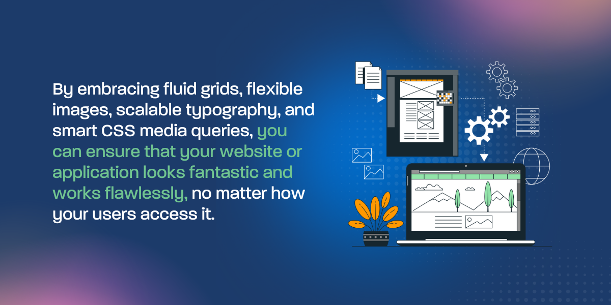
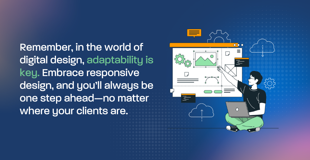
Responsive designing for different screen sizes is no longer optional in our multi-device world—it’s essential. By embracing fluid grids, flexible images, scalable typography, and smart CSS media queries, you can ensure that your website or application looks fantastic and works flawlessly, no matter how your users access it.
For lawyers, dentists, SMEs, and startups alike, a responsive design strategy translates into increased engagement, higher conversion rates, and, ultimately, greater success in the digital landscape. Don’t let outdated designs hold you back. Modernize your digital presence today, and watch as your online interactions transform into real-world growth.
Do you need expert help with reaching your audience, website or graphic design, email marketing, social media management, and other marketing services? Geeks For Growth can help you drive growth for your business!