Teach agencies how to use shared assets, components, and SOPs to deliver on brand faster
The problem your studio keeps bumping into
Your team is talented, your clients are excited, and yet delivery feels slower than it should. Files live in too many places. Designers rebuild the same sections. Brand rules drift from project to project. The fix is not more hustle. The fix is a design system that your whole team can trust.
This guide shows how design systems for agencies remove friction with shared design libraries, reusable component libraries, and practical agency SOPs. You will see how to roll this out across client brands and when to bring in a white label design system partner to speed the work without adding headcount.
What a design system is and why agencies need one
A design system is a shared language for your team. It includes tokens, components, rules, and workflows that turn scattered files into a predictable engine.
Why agencies adopt design systems
- Consistency across multi-brand portfolios
- Faster production with fewer revisions
- Clear handoffs between strategy, design, and dev
- Easier onboarding for new creatives and vendors
Shared libraries vs ad hoc assets
Ad hoc assets look fast until version hell begins. Shared libraries look slower on day one and pay you back during every sprint.
Make libraries the single source of truth
- Tokens for color, type, spacing, elevation
- Components for hero sections, nav bars, CTAs, cards, forms
- Patterns for pricing tables, feature grids, and blog listings
Governance that keeps libraries healthy
- Library owner with weekly review duty
- Changelog that records updates
- Versioning rules so teams roll forward together
SOPs that keep work on the brand
Great systems fail without simple rules. Document the actions that protect quality.
Core SOPs your agency needs
- Intake SOP with brand kit, voice guide, accessibility rules, and file structure
- Build SOP for naming, nesting, variants, and responsive rules
- Review SOP with checklists for QA, accessibility, and performance
- Release SOP for version tags, notes, and rollback plan
QA checklist you can copy today
- Colors map to tokens and pass contrast checks
- Type scales match the brand ladder
- Spacing tokens replace manual pixel values
- Components use approved variants only
- Links, forms, and interactive states are visible and keyboard-friendly
Tooling stack that works for real agency life
Pick tools your team will actually use.
Design and collaboration
- Figma libraries with variables, component properties, and styles
- Notion or Confluence for living documentation
- Loom for short reviews and decision logs
Build and delivery
- Webflow or Framer component mapping from the design library
- Git or Git like versioning for code components, if relevant
- ClickUp or Asana boards with tickets tied to components and SOP steps
Rolling out a system across many client brands
You likely manage ten or more brands. You need a structure that scales.
Multi-brand governance
- One core system for base tokens and primitives
- Brand child libraries that override color, type, and logos
- Pattern packs per vertical, for example, legal, dental, SaaS
Onboarding checklist for new clients
- Gather brand assets, tone, SEO targets, accessibility needs
- Map site or funnel to existing patterns first
- Identify gaps that need net new components
- Confirm who signs off on brand, UX, and compliance
When to partner with a white label design system team
If your designers are stuck maintaining libraries instead of shipping campaigns, bring in help.
Good signals to partner
- Frequent rebuilds of the same modules
- Long ramp time for new hires or freelancers
- Senior designers spending hours on token housekeeping
- Clients are noticing brand drift
What a strong partner provides
- Audit of your current files and structure
- Library rebuild with tokens and documented variants
- SOPs you can hand to any designer on day one
- Ongoing maintenance, updates, and training
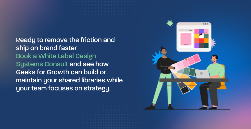
Ready to remove the friction and ship on brand faster? Book a White Label Design Systems Consult and see how Geeks for Growth can build or maintain your shared libraries while your team focuses on strategy.
Quick start plan for the next 14 days
You do not need a six-month overhaul. Start small and build trust.
Week 1
- Pick one client brand with active work
- Create base tokens and three priority components
- Document a one-page Build SOP
Ship one feature using the new components
Week 2
- Add five to seven components that appear often
- Record a five-minute Loom on how to use them
- Run the QA checklist on two live pages
- Retire the old components that cause drift
Measure time saved, revisions reduced, and defects caught. Use the result to roll the model to your next brand.
Your team should not rebuild hero sections for the third time this month. Let us set up the system that makes on brand the default. Book a discovery call to see a sample library, a QA checklist, and a rollout plan that fits your stack.
This article is one piece of your scaling puzzle. For a complete operating system that covers pods, SOPs, QA, onboarding, and pricing, read our cornerstone guide
The Ultimate Playbook for Scaling Agency Output Without Hiring
