Table of Contents
ToggleWhy Dental Websites Need Clear Messaging
A dental website doesn’t win because it looks modern. It wins because patients understand, quickly, why they should trust you—and what to do next.
When messaging is vague, patients do what they always do: they compare. They bounce, click back to Google, and pick the office whose site answers their questions with less friction.
Clear messaging is not “marketing fluff.” It’s operational. It reduces low-quality calls, improves conversion rates, and helps the front desk deal with fewer confused shoppers and more ready-to-book patients.
If you want the broader framework this sits inside, start here: Dental Marketing.
Operator note: if your website messaging is unclear, you don’t just lose website conversions—you lose trust before the call. Patients assume unclear websites belong to unclear practices.
What This Guide Covers
This is a guide to dental website messaging: how to clarify what you do, who you help, and why patients should choose you—without gimmicks, hype, or generic promises.
You will learn:
- How unclear messaging quietly reduces appointment requests
- What “dentist value proposition” actually means (in patient terms)
- The few messages patients look for first (and where they should appear)
- How to balance comfort, credibility, insurance clarity, and convenience
- Common dental website messaging mistakes—and how to fix them
- A practical checklist you can use in one afternoon
Clear Messaging Is a Conversion System, Not a Copywriting Exercise
Most dental websites fail in the same way: they describe the practice in vague, interchangeable language (“compassionate,” “family-friendly,” “state-of-the-art”). None of that is bad. It’s just not specific enough to help a patient decide.
Clear messaging does three jobs at once:
- Reduces risk: patients feel safe choosing you (and calling you).
- Reduces confusion: they know if you’re a fit for their problem (and their schedule).
- Reduces friction: they understand the next step (call, request an appointment, verify insurance, etc.).
If you want the broader “patient trust + website UX” lens, this pairs well with:
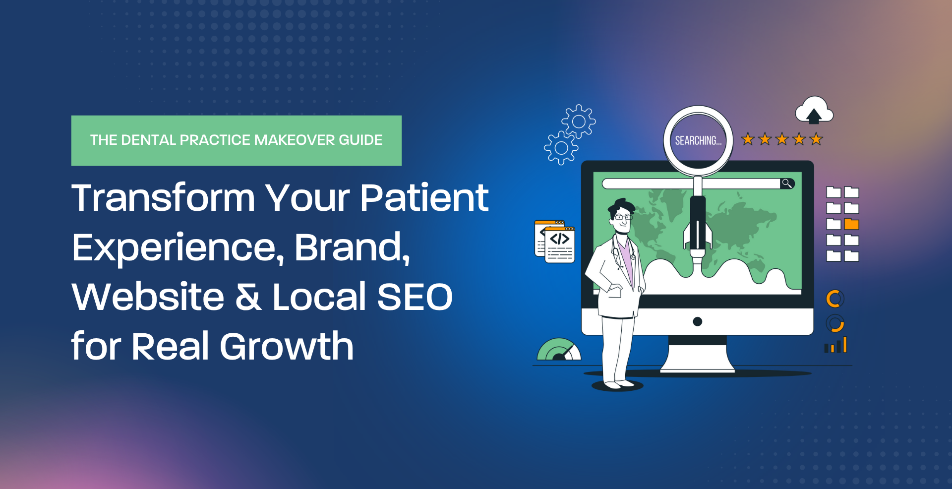
- The Dental Practice Makeover Guide
- 5 Homepage Fixes That Will Instantly Increase Dental Appointment Requests
- What to Include Above the Fold on a Dental Website
What Patients Are Actually Trying to Understand in 10 Seconds
Dental patients don’t arrive on your homepage thinking about your brand story. They arrive with a problem, a question, or a worry. Your messaging has to answer the practical questions first.
General dentistry, emergency visits, sedation, implants, cosmetic, pediatric care—patients need immediate clarity.
Fear is common. Messaging must acknowledge comfort without overpromising.
Patients don’t need exact pricing on the homepage, but they do need transparency signals.
Hours, location, scheduling options, and urgency handling matter more than most practices realize.
Your differentiator should be specific: expertise, experience, technology, comfort model, or patient approach.
One clear primary action: call, book, or request an appointment.
Dentist Value Proposition: What It Is (And What It’s Not)
“Dentist value proposition” sounds like marketing jargon, but it’s actually a simple sentence you can test:
A practical value proposition format
- Who you help: families, anxious patients, cosmetic buyers, implant candidates, busy professionals
- What you help them get: comfort, speed, clarity, long-term oral health, confidence
- How you do it differently: sedation options, same-day availability, technology, experience, care model
- What to do next: call, request, book
What it’s not:
- “We treat you like family.” (Too generic.)
- “State-of-the-art technology.” (Which tech? Why does it matter to the patient?)
- “Affordable dentistry.” (Affordable for who? How do you handle insurance and financing?)
Where Messaging Breaks Most Dental Websites
Most dental sites aren’t “bad.” They’re just missing a few decision-critical elements, which makes everything feel unclear.
| Problem | What patients experience | Fix |
|---|---|---|
| Too many services listed, no hierarchy | “I don’t know what to click.” | Feature 3–5 priority lanes (general, emergency, cosmetic, implants, sedation) and link deeper. |
| No comfort/trust signals | “This feels risky.” | Doctor credibility, patient experience language, reviews, and what a first visit looks like. |
| Insurance/cost is avoided entirely | “They’ll surprise me.” | Explain how you handle insurance verification, estimates, and financing options (high-level). |
| Calls-to-action are scattered | “I’m not sure what to do.” | One primary CTA per page + a consistent header CTA (Call / Request Appointment). |
| Homepage reads like a brochure | “This could be any office.” | Lead with patient decision needs: problem, trust, convenience, next step. |
How to Write “Clear” Dental Messaging Without Overpromising
Dental marketing has trust and ethical boundaries. Clear messaging does not mean big claims. It means specific, verifiable clarity.
Examples: “Same-day emergency appointments when available,” “Sedation options for anxious patients,” “Digital scans for select procedures.”
Patients trust what they can picture: what happens on the first visit, how treatment plans are explained, how questions are handled.
Location, hours, parking, online forms, and scheduling options should be obvious—not hidden.
Video Support: Messaging That Builds Trust Before the Call
This is useful because it reframes “website messaging” as trust-building assets—patients decide faster when they can see and hear the team they’re booking with.
The takeaway: generic phrases don’t differentiate you. Specific messaging attracts patients who value your approach and are ready to book.
This conversation connects messaging to follow-through: after the click, practices lose revenue when the experience is unclear, slow, or inconsistent.
Instagram Support: Patient Communication and Trust Signals
A useful reminder: trust is often built through consistent communication, not “better ads.” Your website messaging should reflect that same tone.
The operator takeaway: messaging should support how your team actually delivers care—patients feel it when your website matches your experience.
This is relevant for practices using AI tools: automation can support consistency, but messaging still needs human clarity and brand alignment.
A Practical “Clear Messaging” Checklist for Dental Websites
If you want to improve clarity quickly, review your homepage and top service pages against this checklist.
Messaging checklist (operator version)
- Above-the-fold clarity: who you help + top services + location + primary CTA
- Trust signals: doctor credibility, reviews, affiliations, and patient experience language
- Comfort messaging: anxiety support, sedation options (if applicable), what patients can expect
- Insurance clarity: how verification works, what you help with, how estimates are handled
- Convenience: hours, scheduling options, emergency availability language, location/parking
- Service navigation: clear lanes to key services (not a wall of links)
- One primary CTA: consistent action on every page
If you want a practical homepage-focused guide, this is a good companion:
Key Takeaways
Clear Messaging Helps Dental Websites Convert Because It Reduces Patient Risk
- Patients decide fast—your website must answer “fit, trust, comfort, cost/insurance, and next step” immediately.
- Generic claims don’t differentiate you. Specific, verifiable clarity does.
- Messaging is a conversion system: it affects call quality, front desk load, and appointment requests.
- Video and process explanations build trust before the first call.
- A clear value proposition is about patient outcomes and decision confidence—not hype.
Explore Related Geeks for Growth Resources
Want a Website That Makes Patients Feel Ready to Book?
Clear messaging doesn’t require a full redesign. It requires the right decision information in the right order—so patients understand your practice and take action without confusion.
Geeks for Growth helps dental practices build conversion-focused websites and search-driven marketing systems that compound over time—grounded in clarity, trust, and measurable improvement.
Explore Dental Marketing Request Strategic Guidance Browse Resources
This content is produced by the Content Team at Geeks For Growth. Through their proprietary Megaphone publishing system and structured SEO framework, they design search-driven marketing systems for law firms, dental practices, remodelers, startups, real estate firms, fintech companies, and agencies across the United States.