What belongs in the top 600px (first scroll) of every startup website and what doesn’t.
Introduction: You Only Get One Scroll
The top of your homepage is prime real estate. It’s where decisions are made: Do I stay, or do I bounce?
Yet, many startup founders—brilliant, scrappy, visionary founders—waste this space on abstract taglines, generic stock photos, or clever slogans that leave users confused.
This isn’t just about design. It’s about conversion psychology.
Because when someone lands on your homepage, they’re not reading—they’re scanning. They’re asking:
- “What do you do?”
- “Is this for me?”
- “Why should I care right now?”
The goal of this article is simple: help you build an above-the-fold section that sells your startup without shouting, stuffing, or spinning.
The Purpose of Above-the-Fold: Clarity, Not Cleverness
Let’s cut to the chase:
Your above-the-fold content needs to answer 3 questions within 5 seconds:
- What is this? (Clear positioning)
- Who is it for? (Audience relevance)
- What should I do next? (Call to action)
If you miss even one, you’ve just paid for traffic that converts somewhere else.
What to Avoid
- Vague hero statements like “Reimagine the future of engagement.”
- Auto-playing videos that delay your value message.
- Zero CTAs or scattered buttons.
- Cluttered menus and visual overload.
What to Include
- One clear headline (your value prop, not a poem).
- One supporting sentence (who it’s for + what it helps them do).
- Primary CTA (Schedule Demo, Try Free, Join Waitlist).
- Social proof if available (logos, quotes, stats).
- Visual anchor (screenshot, product mockup, or founder photo).
Startup Above-the-Fold Template (Use This)
[Headline]: Save 10 Hours a Week With Smarter Client Reporting
[Subheading]: Built for busy marketing teams who need accurate insights—fast.
[CTA Button]: Get My Free Report Now
[Visual]: Dashboard screenshot or short Loom demo
[Trust Badge]: “Trusted by 500+ startups” or logos
Think of it as your 5-second elevator pitch—but with pixels.
Why This Matters for Seed-Stage Founders
You’re not just designing a website. You’re building trust before a conversation even starts.
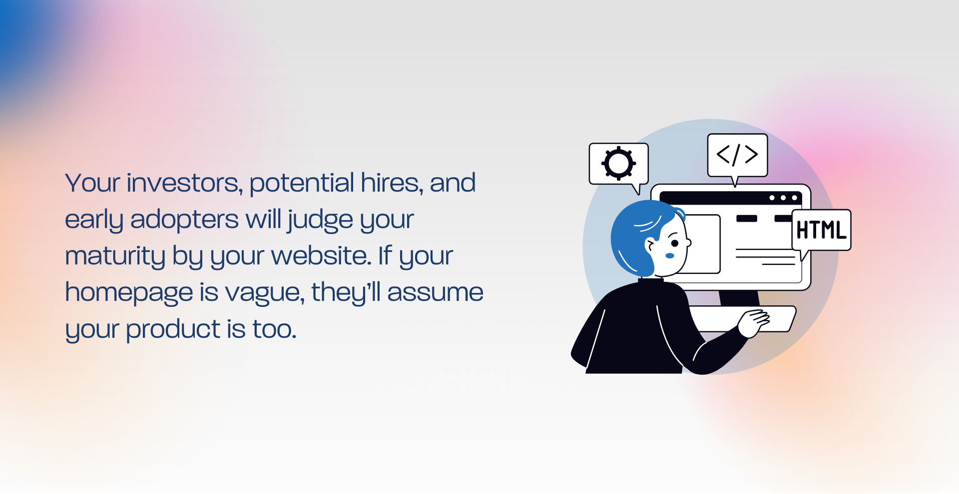
Your investors, potential hires, and early adopters will judge your maturity by your website. If your homepage is vague, they’ll assume your product is too.
Real Startup Example:
A pre-revenue fintech startup moved their CTA above the fold and clarified their positioning headline. Bounce rate dropped by 22%. Demo signups increased 44%—without changing the product.
Pro Tip: Do a 5-Second Test
Here’s how:
Show your homepage (just the first screen) to 5 people unfamiliar with your startup.
Give them 5 seconds.
Then ask: “What do you think this company does?”
If they say “I’m not sure” or get it wrong… it’s time to revise.
Need help? Our team does these tests weekly with startups just like yours. Book a free homepage UX teardown here →
Fix the First Scroll
The top 600px of your homepage isn’t decoration. It’s the single most important sales pitch your brand will ever make.
And if it’s confusing, slow, or self-indulgent—no ad, email, or SEO strategy can save you.
If you want a homepage that sells your vision before your product is even live:
This article expands on principles outlined in our Startup Design Playbook, especially the Website & UX That Sells Your Vision section.
If your homepage isn’t converting, chances are your above-the-fold messaging is the leak.
Go deeper into positioning, user testing, and design psychology in the full guide.