Introduction: Your MVP’s First Audience Lives on Mobile
Let’s be blunt: if your MVP doesn’t work on mobile, it doesn’t work.
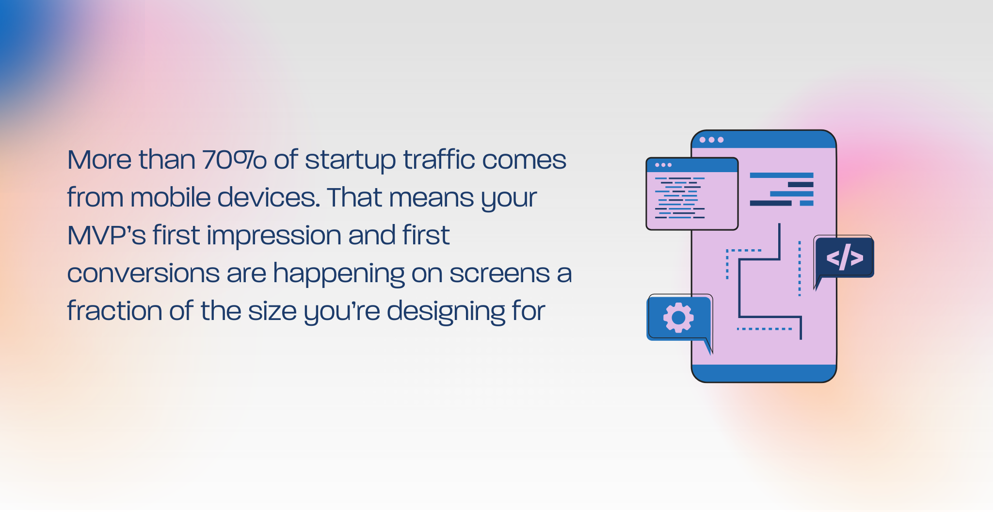
Founders often obsess over desktop mockups in Figma, polishing pixels that their first 1,000 users will never see. The truth? More than 70% of startup traffic comes from mobile devices. That means your MVP’s first impression and first conversions are happening on screens a fraction of the size you’re designing for.
And yet, many early-stage teams make the same mistake: they either over-engineer with bloated features or under-deliver with stripped-down pages that frustrate mobile users. The balance is tricky, but when you get it right, your MVP earns trust, traction, and time.
This article will show you how to avoid the common mobile-first mistakes founders make and how to build lean, conversion-ready experiences that scale.
Why Mobile-First Design Matters for MVPs
Your MVP isn’t supposed to be perfect. It’s supposed to be useful and usable. For early users, that means accessible on the device in their pocket.
Mobile-first design forces you to:
- Prioritize core features over nice-to-haves.
- Write sharper copy (no one scrolls through paragraphs on mobile).
- Simplify navigation so users don’t get lost.
- Test conversion flows (signups, waitlists, demos) in real-world conditions.
Here’s the kicker: if your MVP converts on mobile, it will convert anywhere.
The Most Common Mobile-First Mistakes Founders Make
Mistake 1: Designing Desktop-First
You craft a stunning landing page on a 27-inch monitor, only to watch it collapse into chaos on a phone. Always start with the smallest screen, then scale up.
Mistake 2: Overloading the Hero Section
Above-the-fold design isn’t about cramming everything in. On mobile, less is more: a clear headline, short subtext, and one strong CTA.
Mistake 3: Forgetting Thumb-Friendly UX
If users can’t reach your CTA with their thumb, they won’t click it. Buttons should be large, centered, and high-contrast. Think usability, not artistry.
Mistake 4: Slow Load Times
Every extra second of loading = higher bounce. Keep images compressed, use fewer scripts, and prioritize speed.
Mistake 5: Overengineering with Animations
That slick scroll effect may wow investors in your demo, but on a user’s 4G connection, it’s death. Lean MVPs mean lean design.
What a Mobile-First MVP Homepage Should Include
Here’s a starter layout for your top 600px:
- Headline: Simple, benefit-first (e.g., “Track Expenses in 60 Seconds, No Spreadsheets.”)
- Subheading: Who it’s for + why it matters.
- Primary CTA: Join waitlist / Try demo / Book intro call.
- Visual Anchor: Clean screenshot or mockup of product.
- Trust Signal: Even if it’s just “Backed by Y Combinator” or a testimonial snippet.
Keep scrolling sections for secondary info. Remember: your first scroll should sell.
Real Startup Snapshot
A SaaS founder we worked with at Geeks for Growth had a homepage packed with five CTAs, a looping background video, and paragraphs of “vision” copy. It looked beautiful on desktop, disastrous on mobile.
We rebuilt their MVP homepage using a mobile-first layout: one headline, one CTA, one visual. The result? Bounce rate dropped 31%, trial signups doubled, and their paid ads finally stopped bleeding cash.
The Rule of Thumb (Literally)
Here’s the simplest test:
Open your MVP site on your phone. Can you:
- Read the headline in a glance?
- See the CTA without scrolling?
- Tap the button with one thumb?
If not, your MVP isn’t ready for mobile.
From MVP to Growth: What’s Next
Mobile-first design doesn’t mean ignoring brand polish or UX enhancements. It means earning the right to add them once you’ve proven conversions on the smallest screen.
When you’re ready to grow, your mobile-first MVP becomes the foundation for a consistent, scalable design.
This article expands on the Website & UX That Sells Your Vision section of our Startup Design Playbook. If you’re building a brand and MVP on a lean budget, the playbook shows you how to integrate design, branding, and go-to-market creative into one growth system.
Ready to See If Your MVP Passes the Mobile Test?
Most startups don’t have a design problem; they have a conversion leak hiding in their mobile experience.
At Geeks for Growth, we help founders fix the first impression where your homepage, UX, and brand voice meet the user’s thumb.
[Book a Free 15-Minute MVP UX Audit]
Only 3 audit slots per industry/month. Don’t wait until you’ve burned ad spend to find out your MVP isn’t mobile-ready.