fbpx Cash Freely - Geeks For Growth

UI/UX Case Study

About The
Project

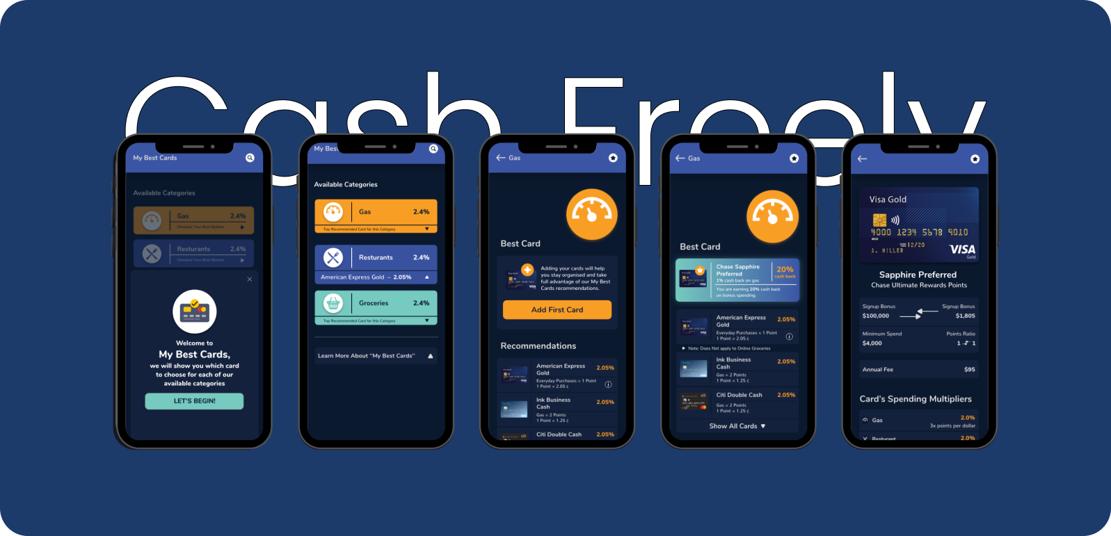
I was asked to design a new feature for the CashFreely app. To begin the design process, I reviewed the existing Cash Freely application design to understand the user journey, different touchpoints, and familiarize myself with the existing design language, type, and color usage. Additionally, I reviewed the competition to understand how they treated similar features in their applications and identify the advantages and disadvantages of their approach. From my research, I learned that keeping the user experience easy and simple will add the most value while designing and adding the new feature to the existing Cash Freely Application. With the takeaways from my research, I set out to develop low and high-resolution wireframes to map out different elements that will form part of the content, customer journey, and user experience, taking into account all of the feedback previously shared with me

Colors

Font Family

Wireframes

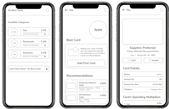
After taking the learnings from my research, I developed low and high-resolution wireframes to map out different elements that will form part of the content, customer journey, and user experience, taking into account all of the feedback previously shared with me. I experimented with multiple iterations for different content types to see which works best with respect to Cash Freely users and is more effective and easy to use. My goal was to keep it fun, simple, and intuitive. I built on the previous wireframes and improved my approach, keeping functionality at the center.